
Website Design Copyright 2026 © 宏侑廣告視覺設計社
All Rights Reserved. 網頁設計 by 覺醒設計

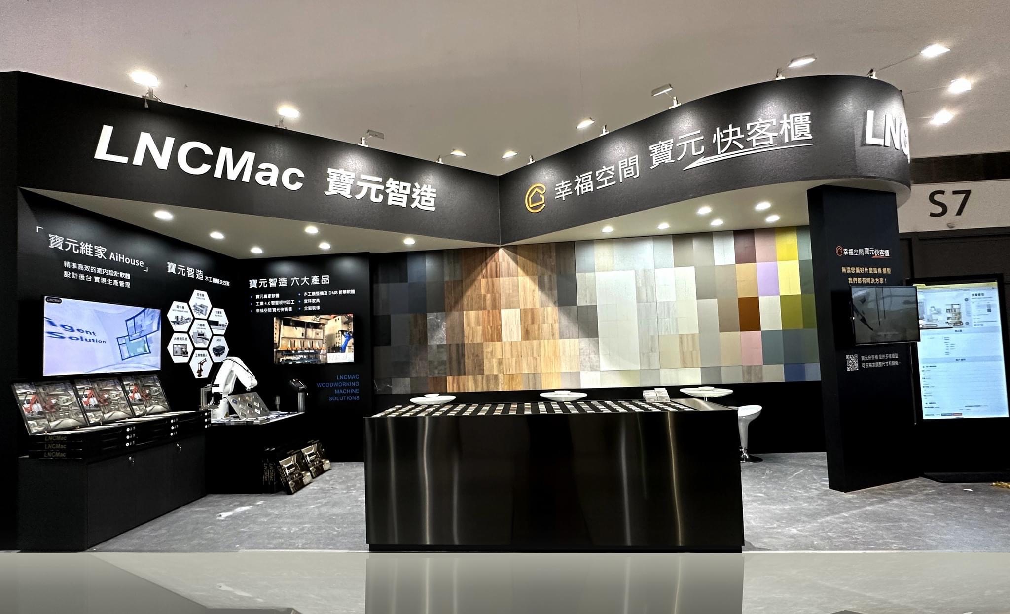
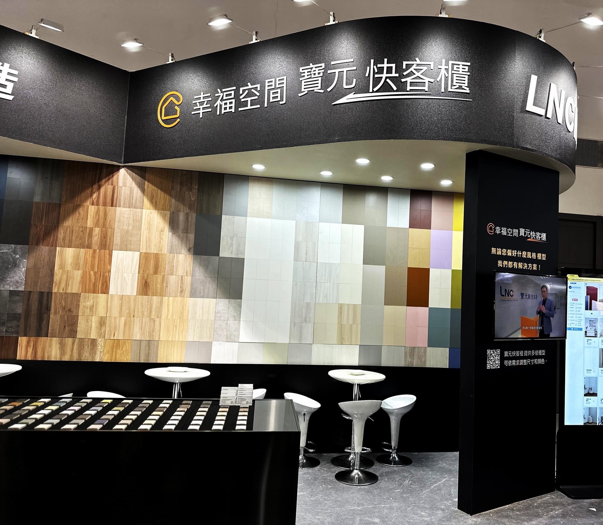
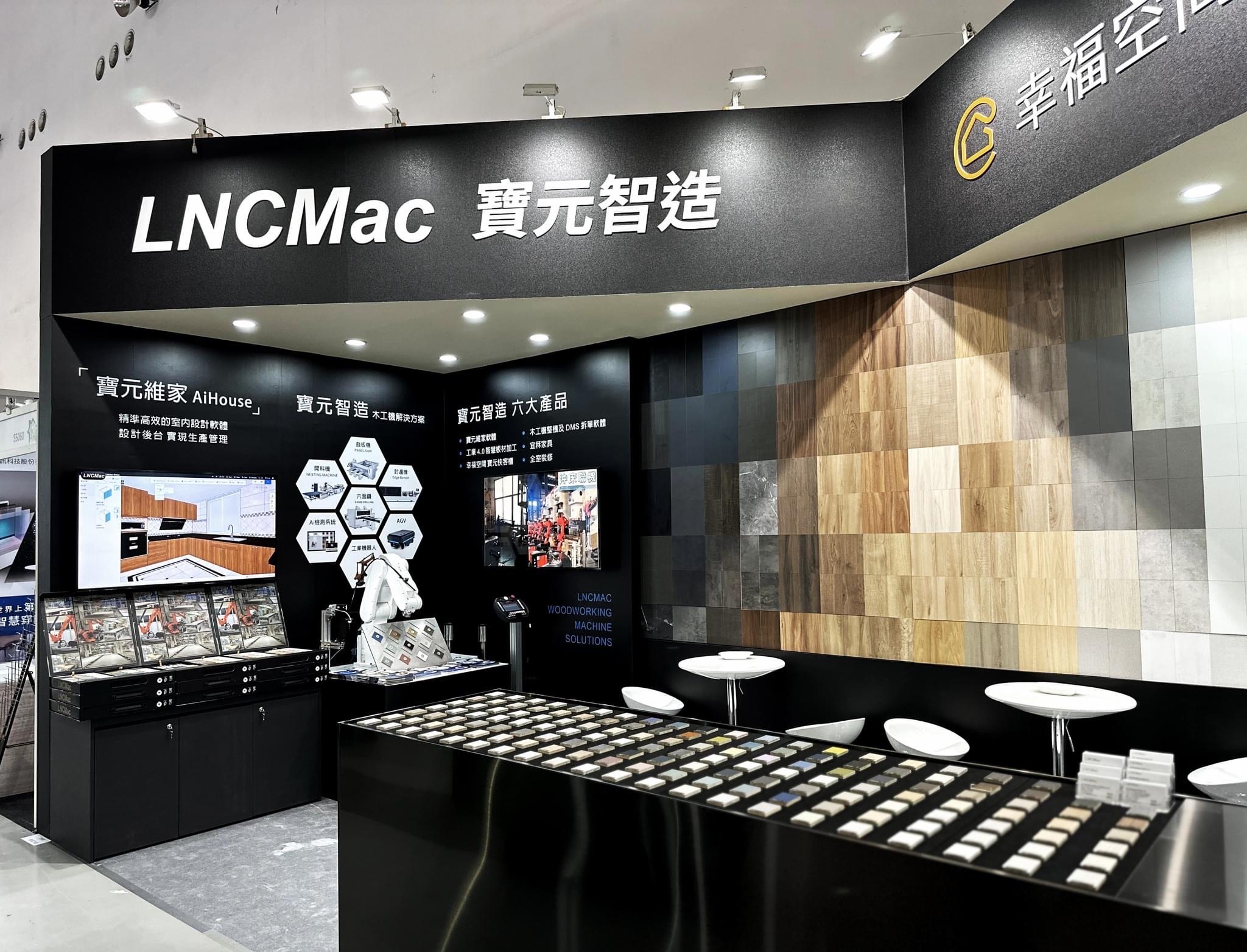
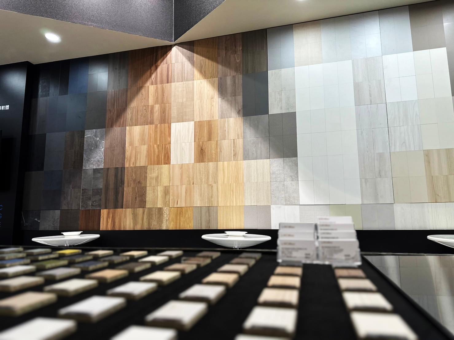
寶元快客櫃展場設計
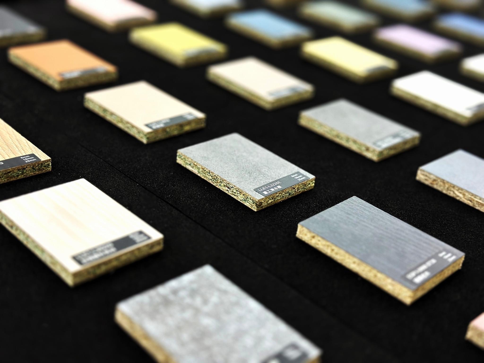
在這次「寶元智造 x 幸福空間」的展場設計中,我們試圖在「工業 4.0 的精準」與「居家空間的溫度」之間,構建一場理性的浪漫。 整體空間以極致的消光黑作為基底,象徵寶元(LNC)在數控技術上的精密與穩重;這不僅是展場的結構,更是一個安靜的舞台,讓主角——「材質」得以在其上盡情展演。 主視覺牆面我們打破了傳統的陳列方式,轉化為一面矩陣色譜牆(Pixelated Matrix)。利用不同色階與紋理的板材,如同馬賽克藝術般拼接,隱喻著系統櫃「模組化」的核心精神。 左側的機械手臂代表「智造」的硬實力,右側的色彩牆則演繹了「生活」的軟實力。透過設計語彙將兩者串聯,傳遞出品牌的核心哲學:因為有最精準的科技支撐,才能實現最自由的拼貼生活。
For the "LNCMac Smart Manufacturing x Gorgeous Space" exhibition, we aimed to construct a "rational romance"—striking a perfect balance between the precision of Industry 4.0 and the warmth of domestic living. We utilized a profound matte black as the spatial foundation. This choice symbolizes the stability and precision of LNC's CNC technology. It serves not merely as a structural element, but as a silent stage, allowing the true protagonist—the materials—to take the spotlight. For the main visual feature, we broke away from traditional display methods, transforming the surface into a Pixelated Matrix. By arranging panels of varying gradients and textures like a mosaic artwork, we visually articulate the core spirit of modularity inherent in system cabinetry. The robotic arm on the left embodies the "hard power" of smart manufacturing, while the vibrant spectrum on the right interprets the "soft power" of lifestyle aesthetics. By bridging these elements through design, we convey the brand's core philosophy: It is the support of precise technology that enables the absolute freedom to design one's ideal life.
依據歐盟施行的個人資料保護法,我們致力於保護您的個人資料並提供您對個人資料的掌握。
按一下「全部接受」,代表您允許我們置放 Cookie 來提升您在本網站上的使用體驗、協助我們分析網站效能和使用狀況,以及讓我們投放相關聯的行銷內容。您可以在下方管理 Cookie 設定。 按一下「同意」即代表您同意採用目前的設定,更多資訊請瀏覽 隱私權聲明。