
Website Design Copyright 2026 © 宏侑廣告視覺設計社
All Rights Reserved. 網頁設計 by 覺醒設計

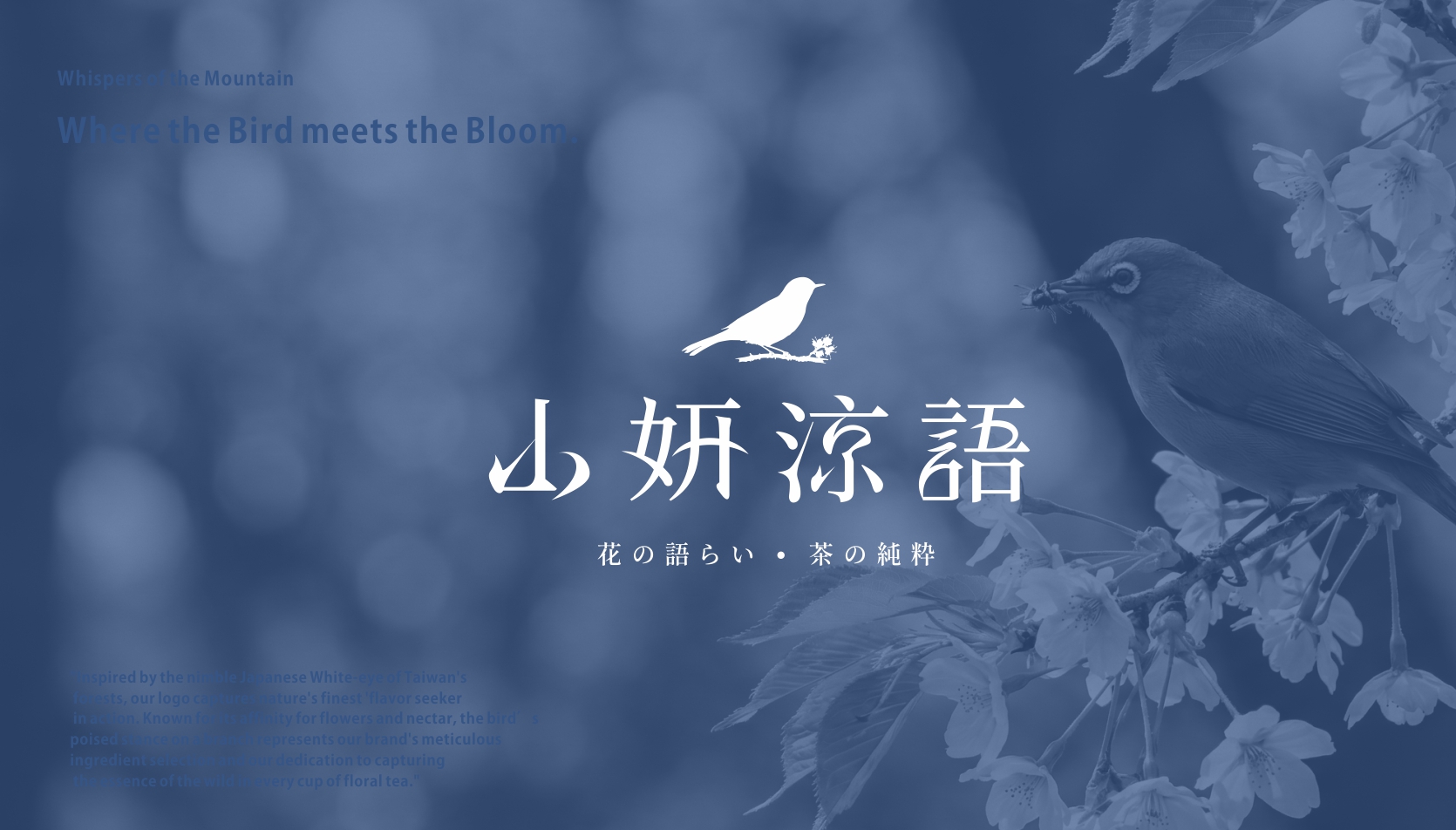
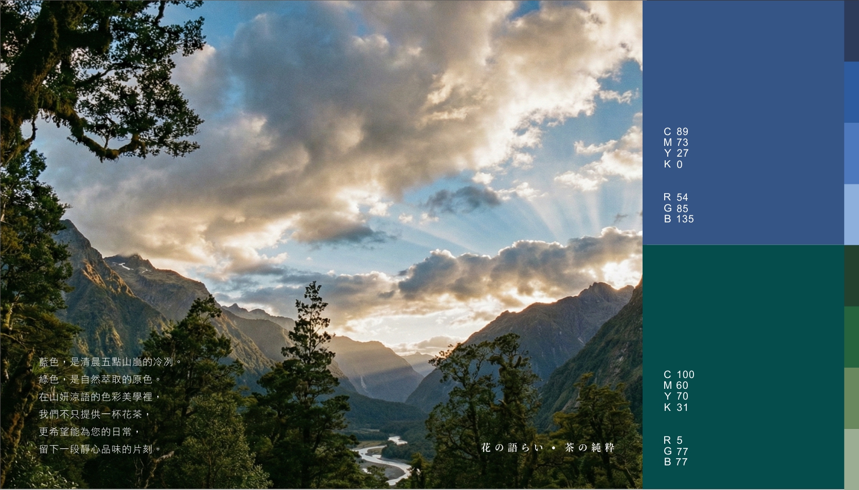
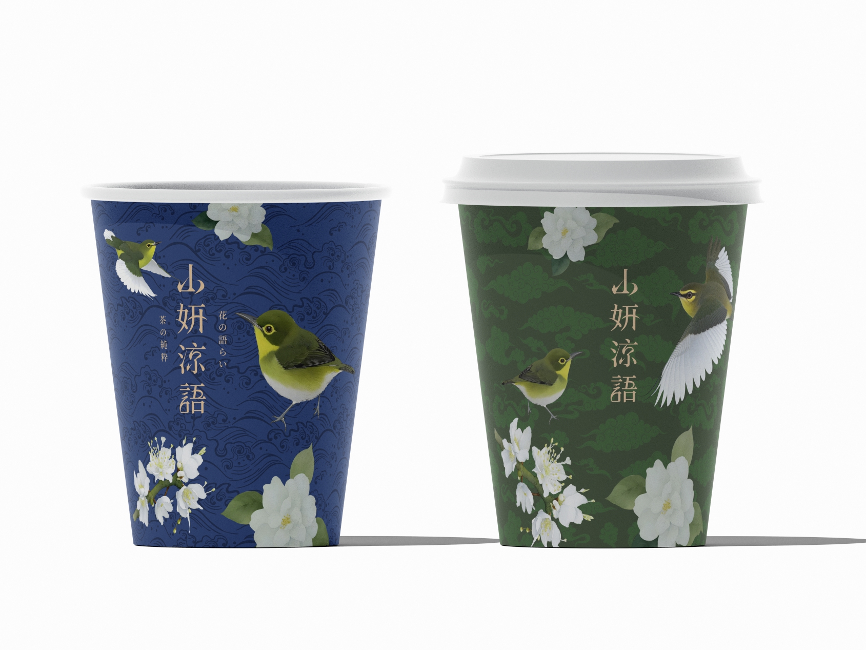
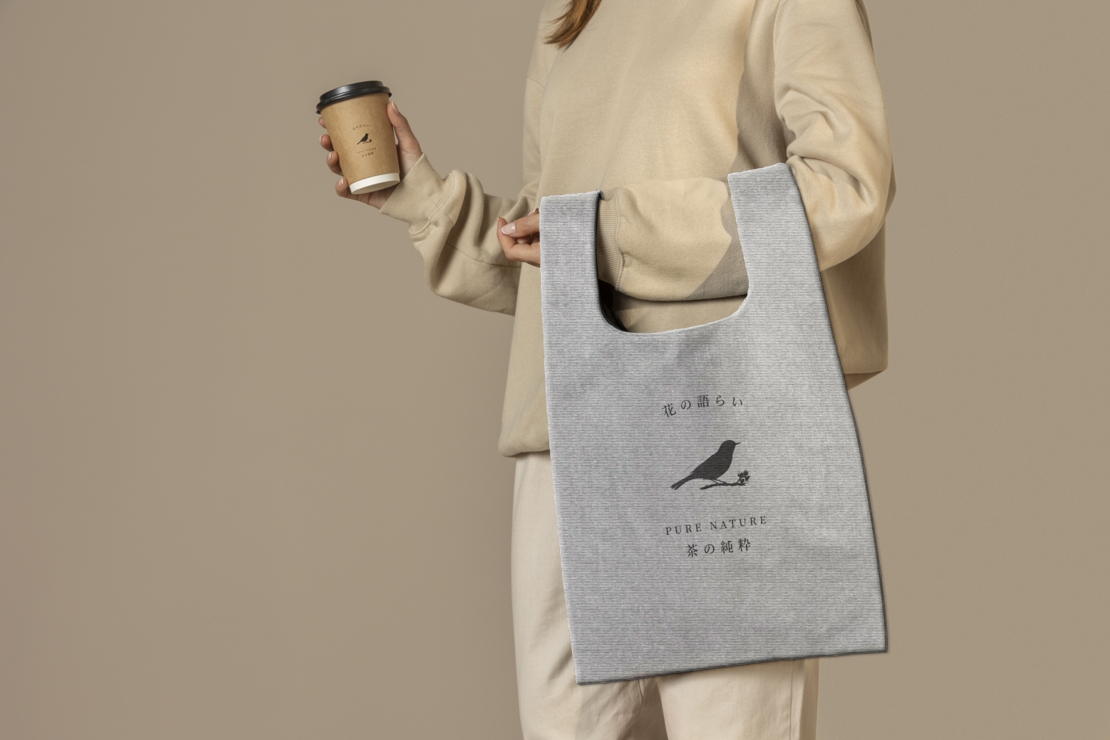
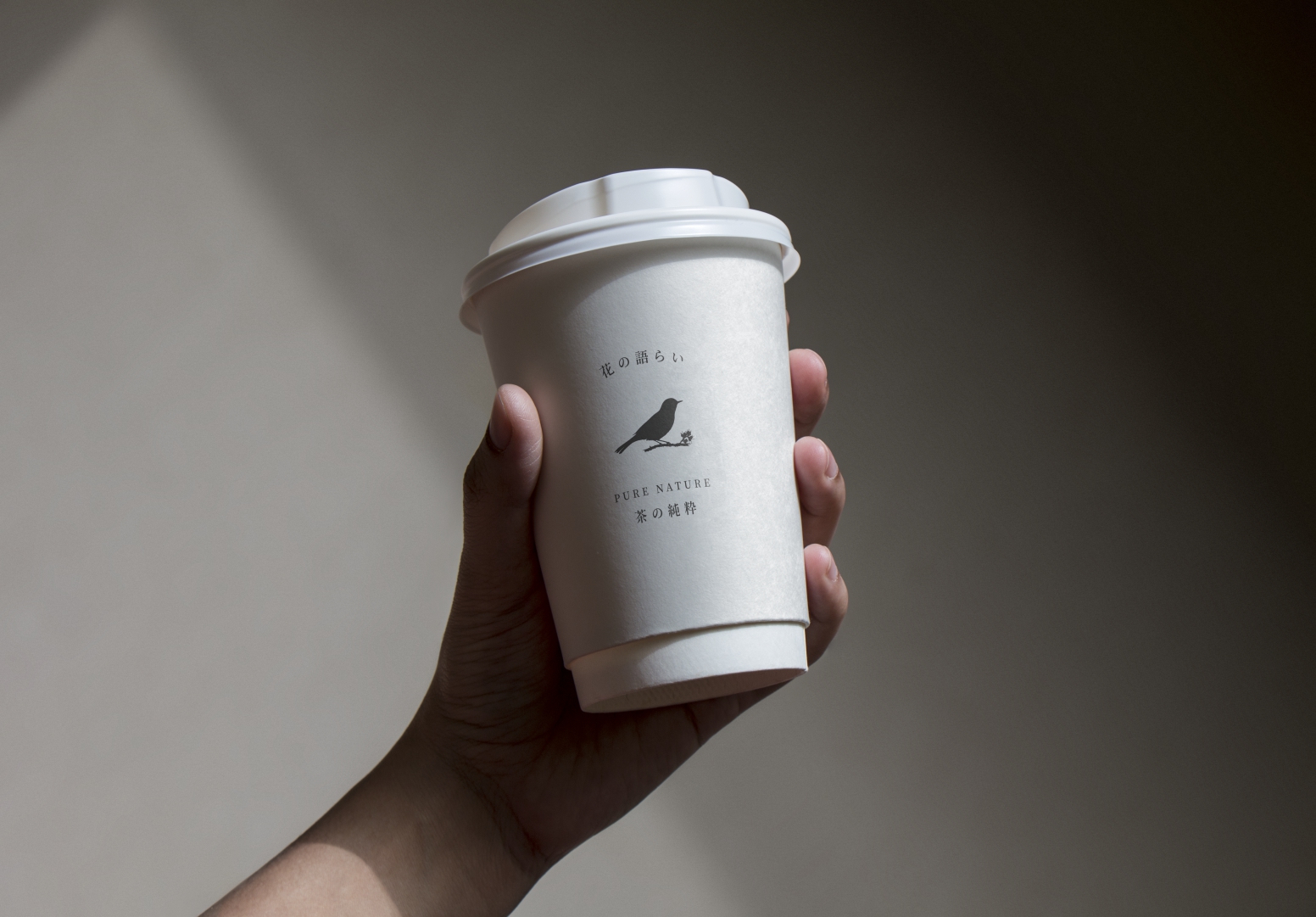
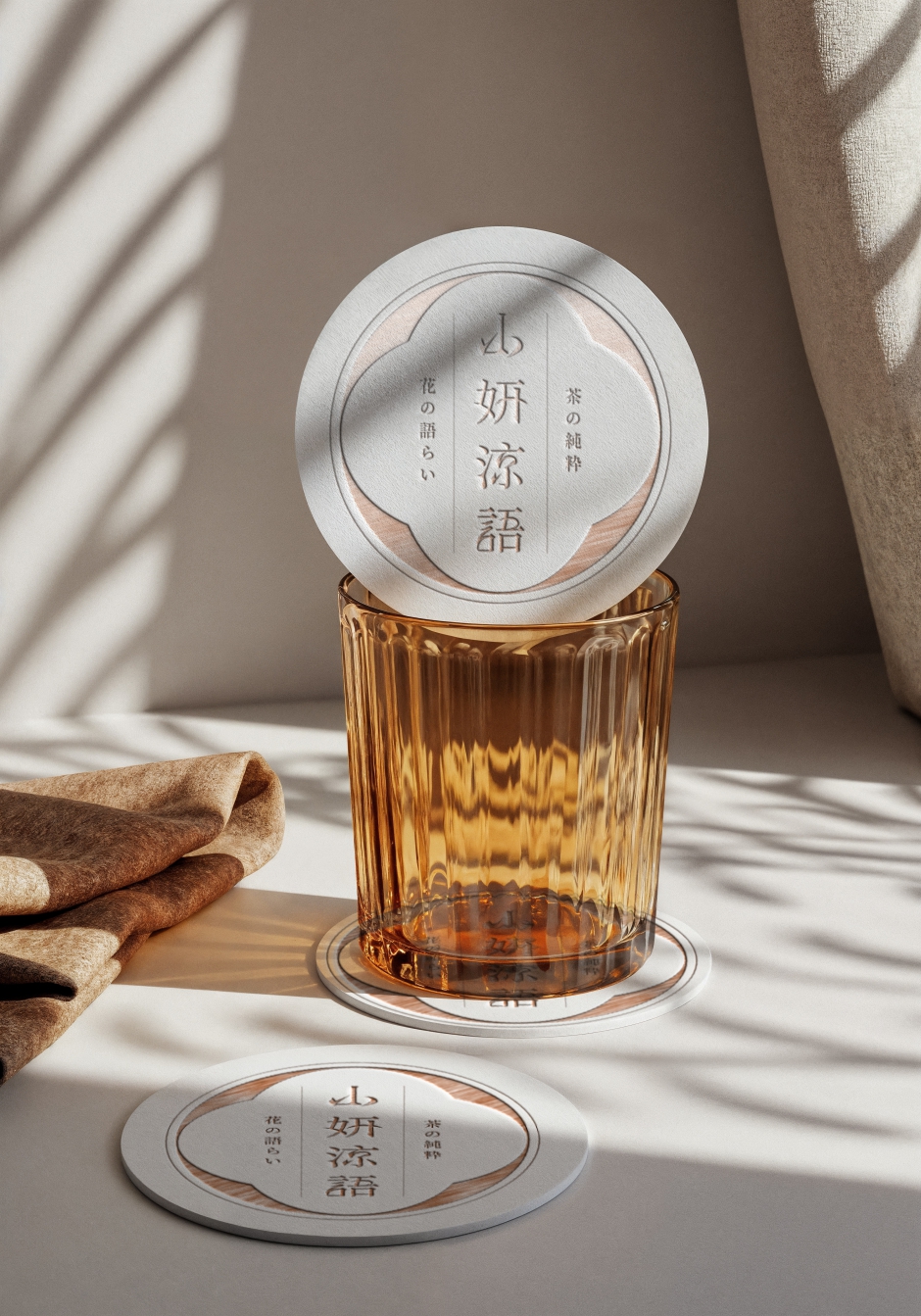
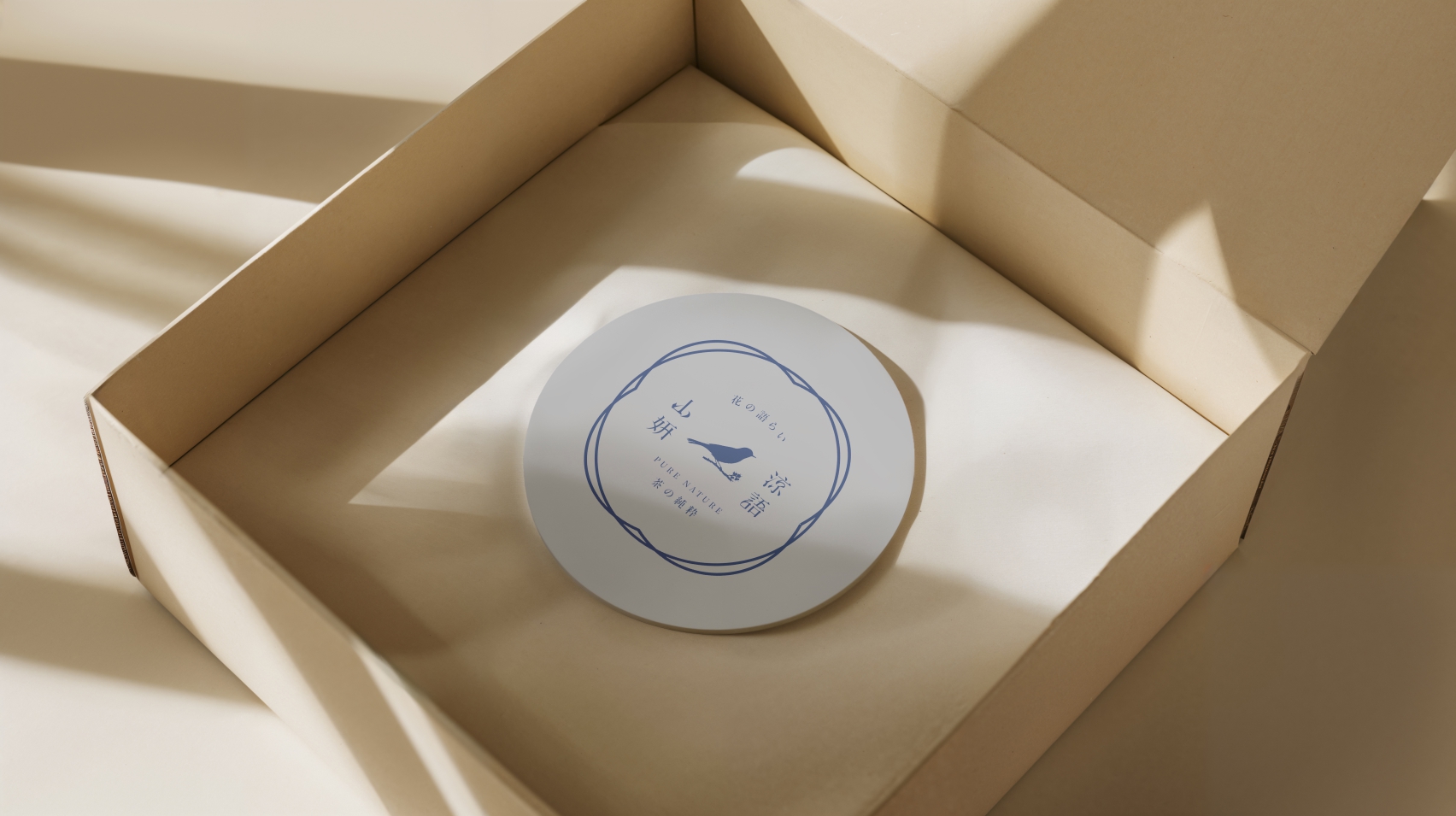
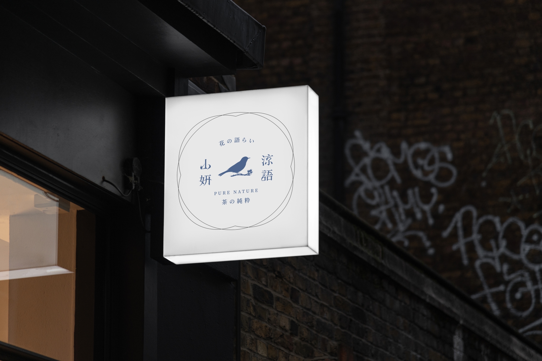
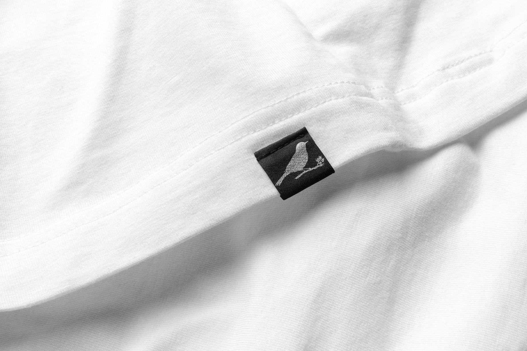
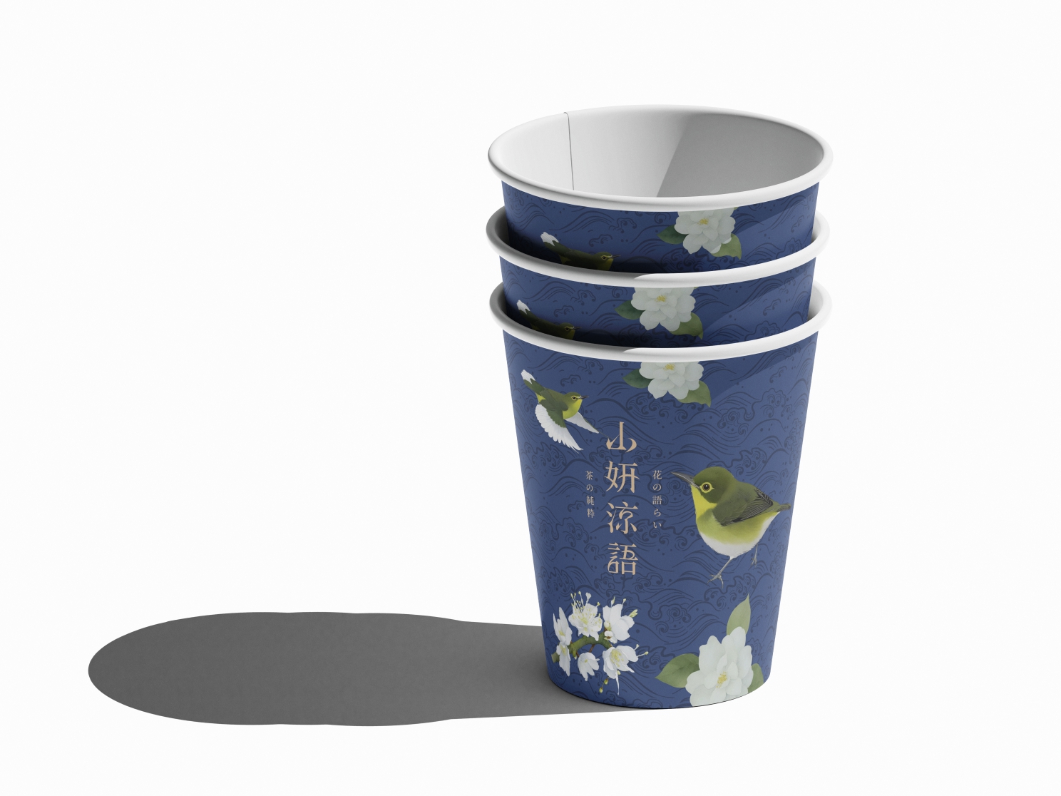
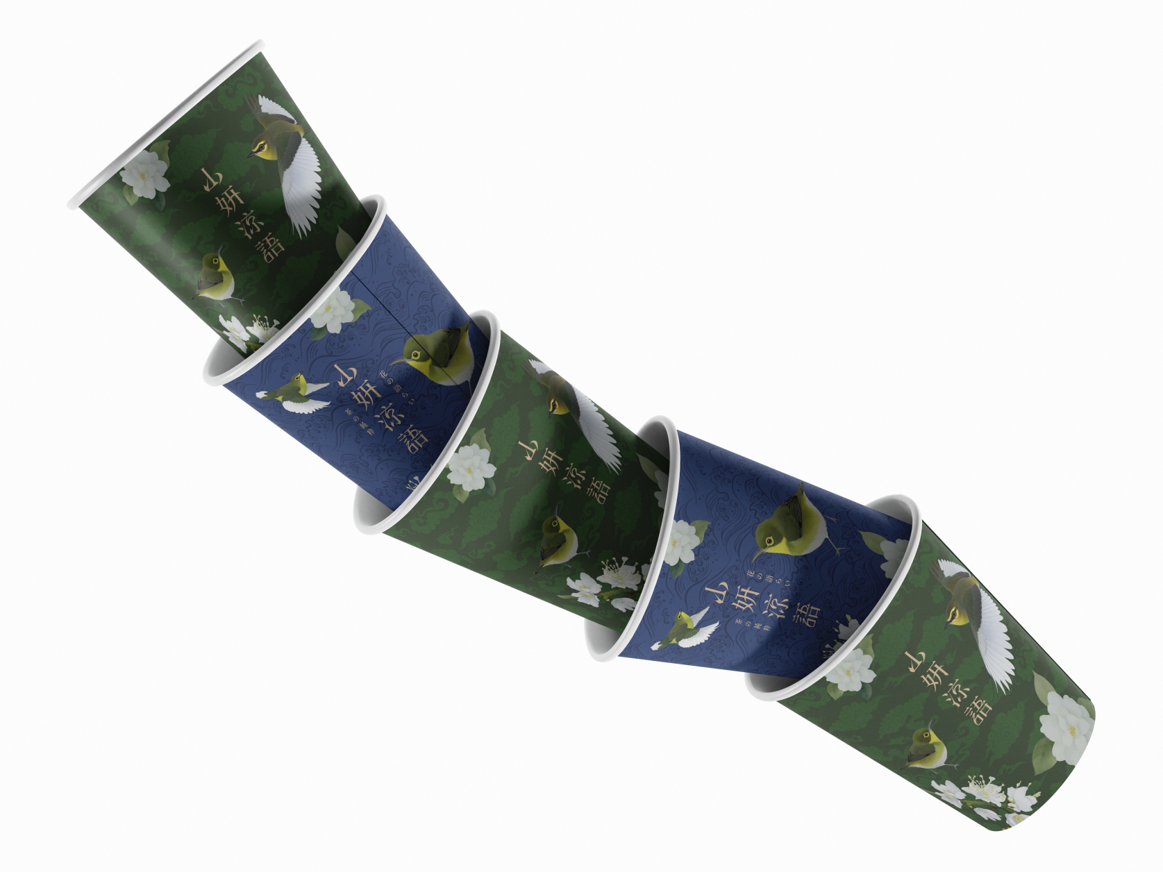
山妍涼語
我在設計 山妍涼語 的時候,一開始並沒有想做一個華麗、搶眼的飲料品牌。 現在市場上的飲料,大多味道很重、顏色很亮,但花茶本來就不是那樣的東西。 相較於其他飲料類型,花茶本身就有它的獨特性,不需要靠強烈的包裝或視覺去證明存在感。 我認為花茶應該是輕的、乾淨的,有一種空氣感, 所以整體視覺選擇了偏日式的風格,用比較安靜、節制的方式呈現。 會選擇 綠繡眼 當作主視覺,是因為牠很小、很安靜, 常常出現在花叢與茶園旁邊,但不會搶走花的注意力。 這也很像我們這個品牌的角色——陪著花,而不是蓋過花。 整體設計的重點不在裝飾,而在節制。 少一點設計,多一點感覺, 讓花的香氣、茶的溫度,成為真正的主角。
When designing Shanyan Liangyu, I never intended to create a flashy or attention-seeking beverage brand. In today’s market, many drinks rely on strong flavors and bright colors. But floral tea is different by nature. Compared to other beverage categories, floral tea already carries its own uniqueness—it doesn’t need loud visuals or heavy styling to prove its presence. I believe floral tea should feel light, clean, and full of air. That’s why the overall visual direction leans toward a Japanese aesthetic, emphasizing calmness, restraint, and simplicity. The Japanese White-eye was chosen as the key visual because it is small and quiet. It is often seen around flowers and tea gardens, yet it never steals attention from them. In many ways, it reflects the role of this brand—to accompany the flowers, not to overpower them. The focus of the design is not decoration, but restraint. Less design, more feeling. Let the fragrance of the flowers and the warmth of the tea be the true protagonists.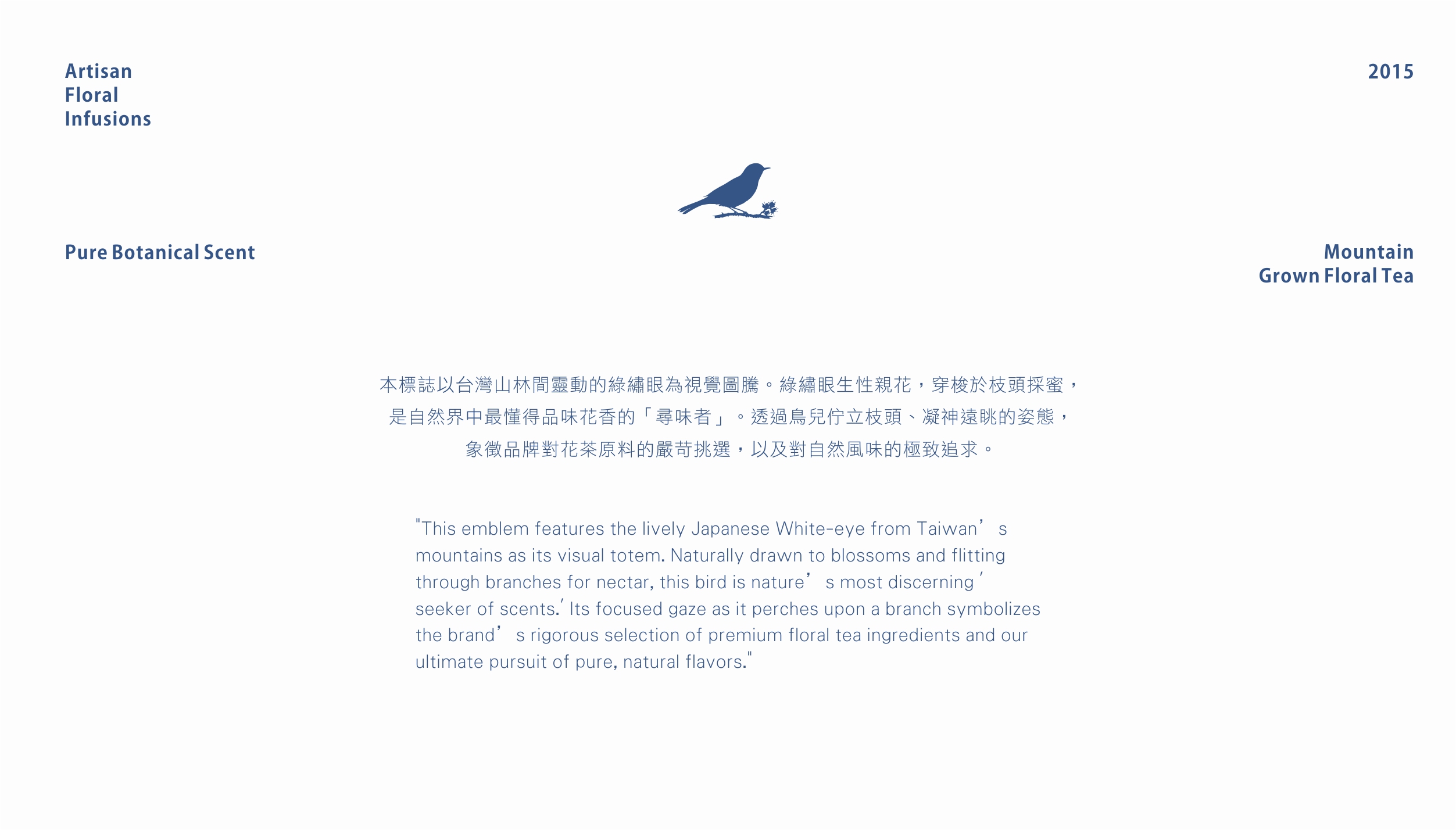

依據歐盟施行的個人資料保護法,我們致力於保護您的個人資料並提供您對個人資料的掌握。
按一下「全部接受」,代表您允許我們置放 Cookie 來提升您在本網站上的使用體驗、協助我們分析網站效能和使用狀況,以及讓我們投放相關聯的行銷內容。您可以在下方管理 Cookie 設定。 按一下「同意」即代表您同意採用目前的設定,更多資訊請瀏覽 隱私權聲明。