



Website Design Copyright 2026 © 宏侑廣告視覺設計社
All Rights Reserved. 網頁設計 by 覺醒設計

布布越式小館
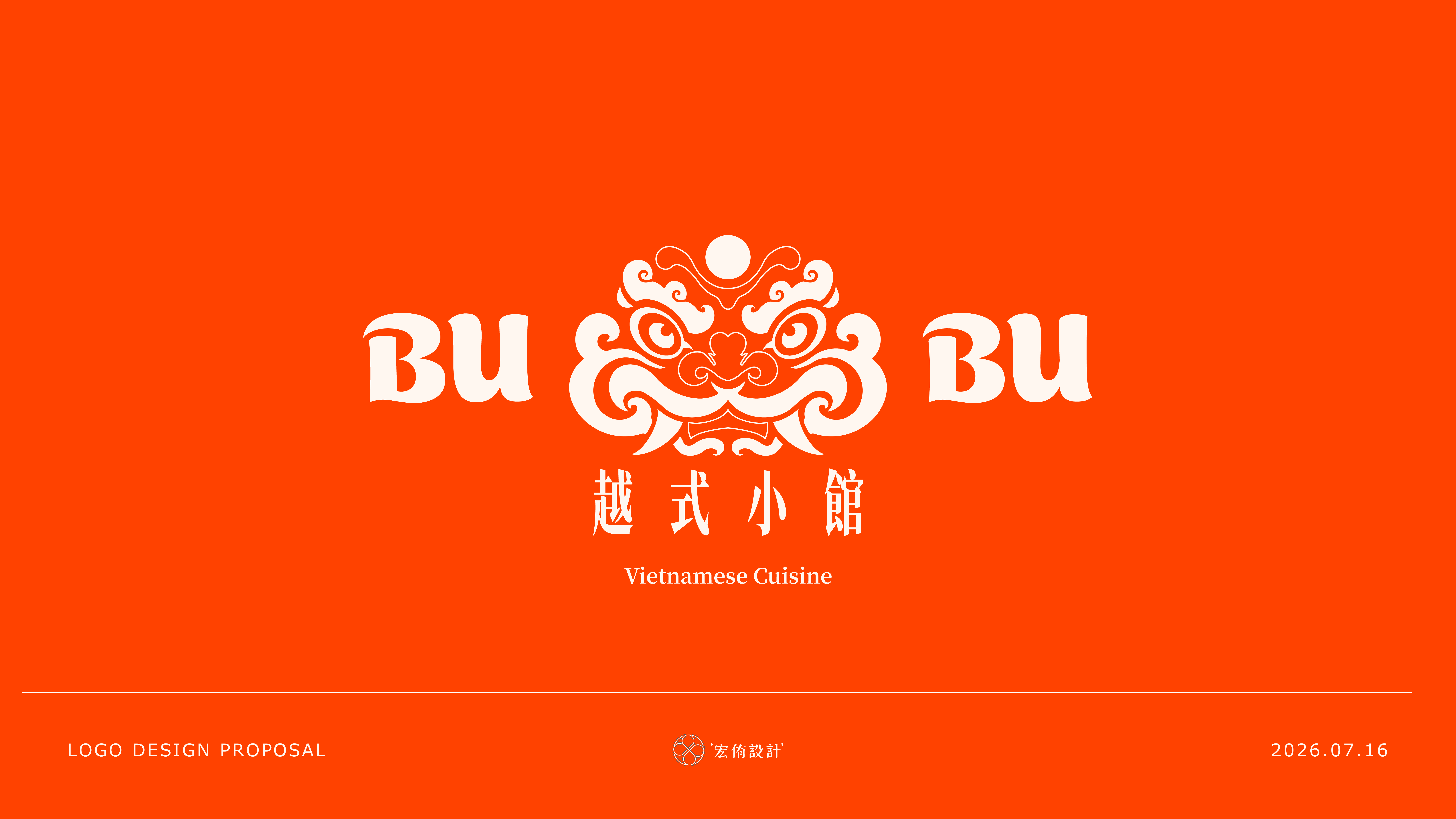
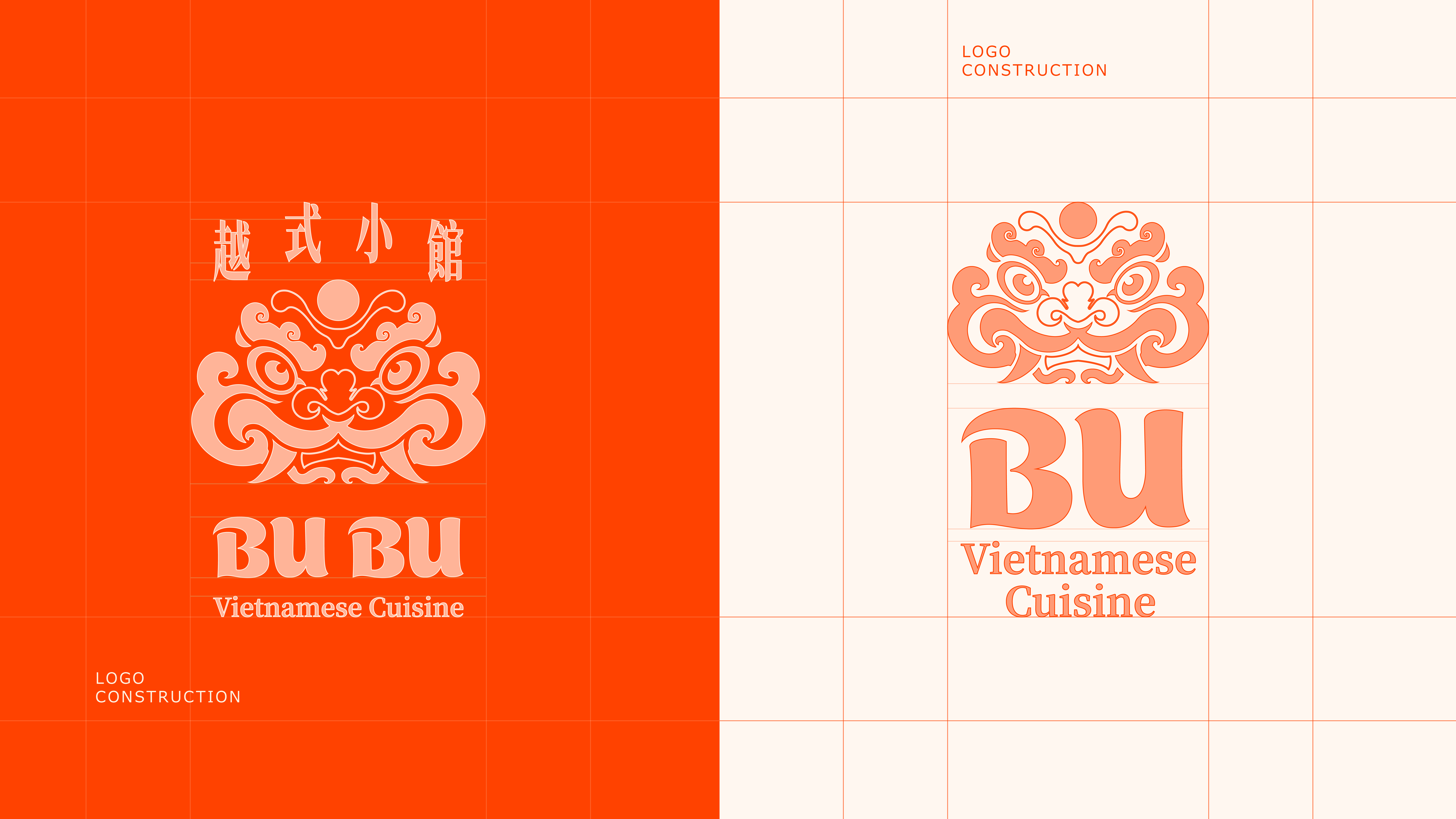
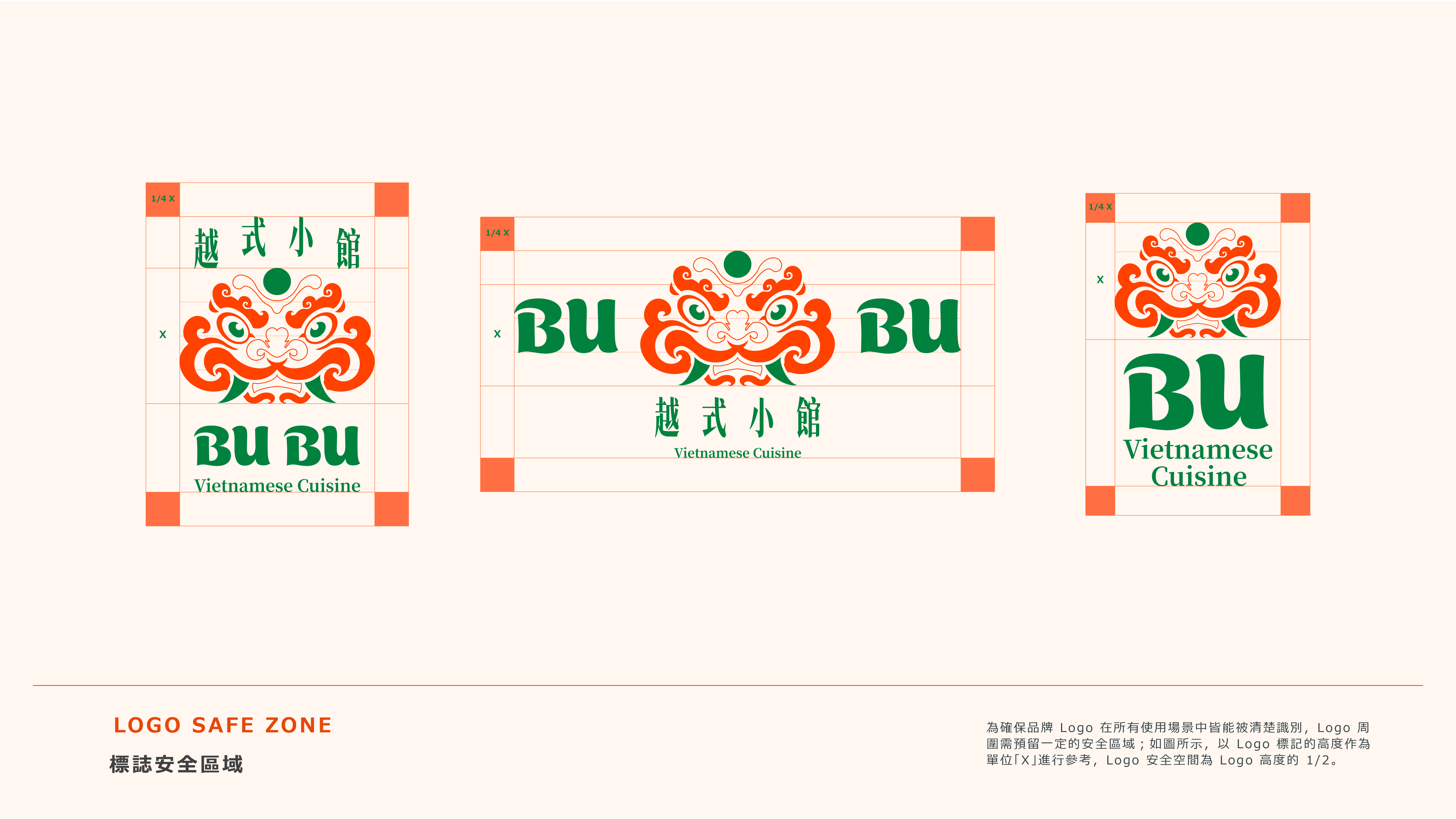
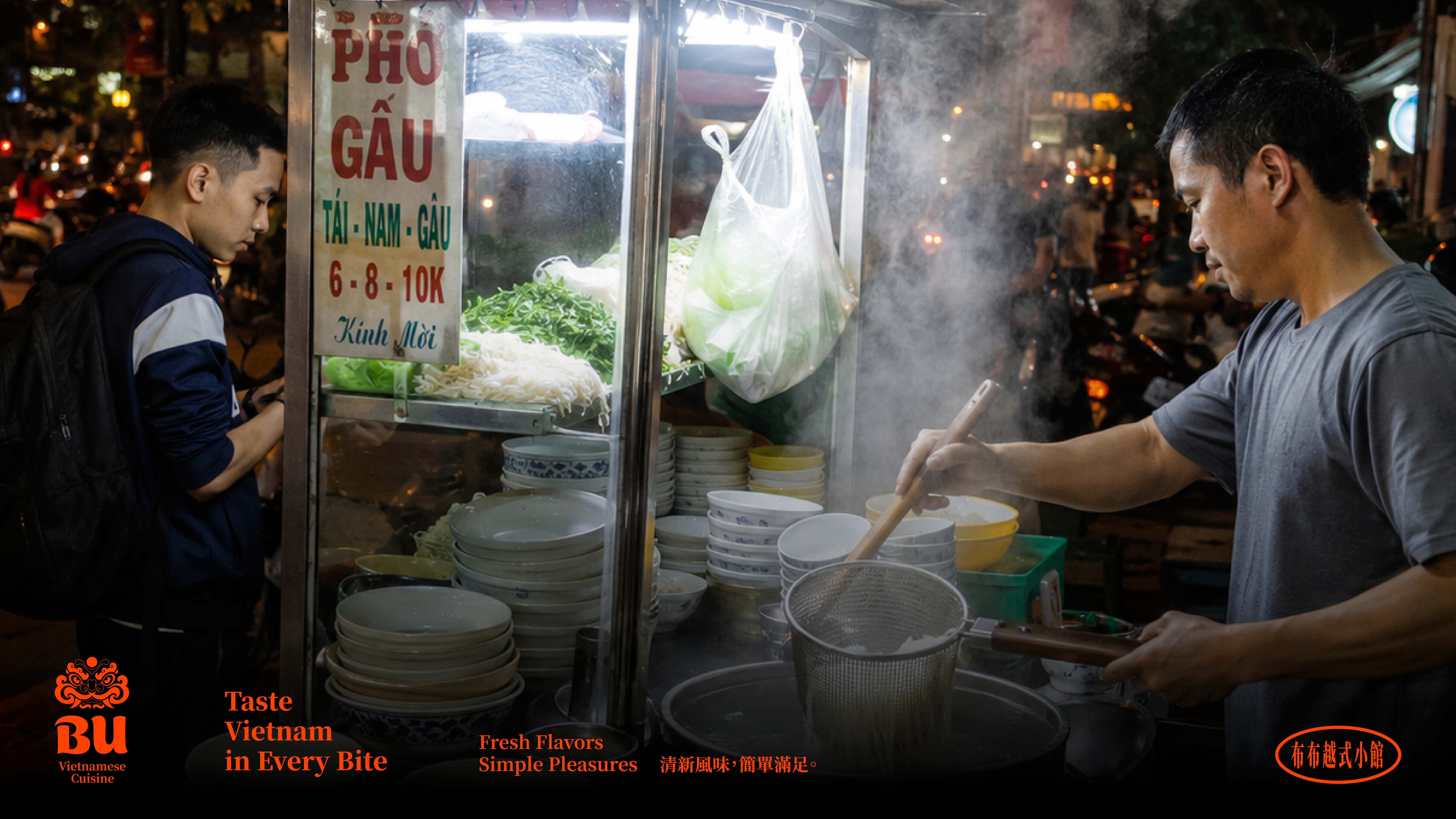
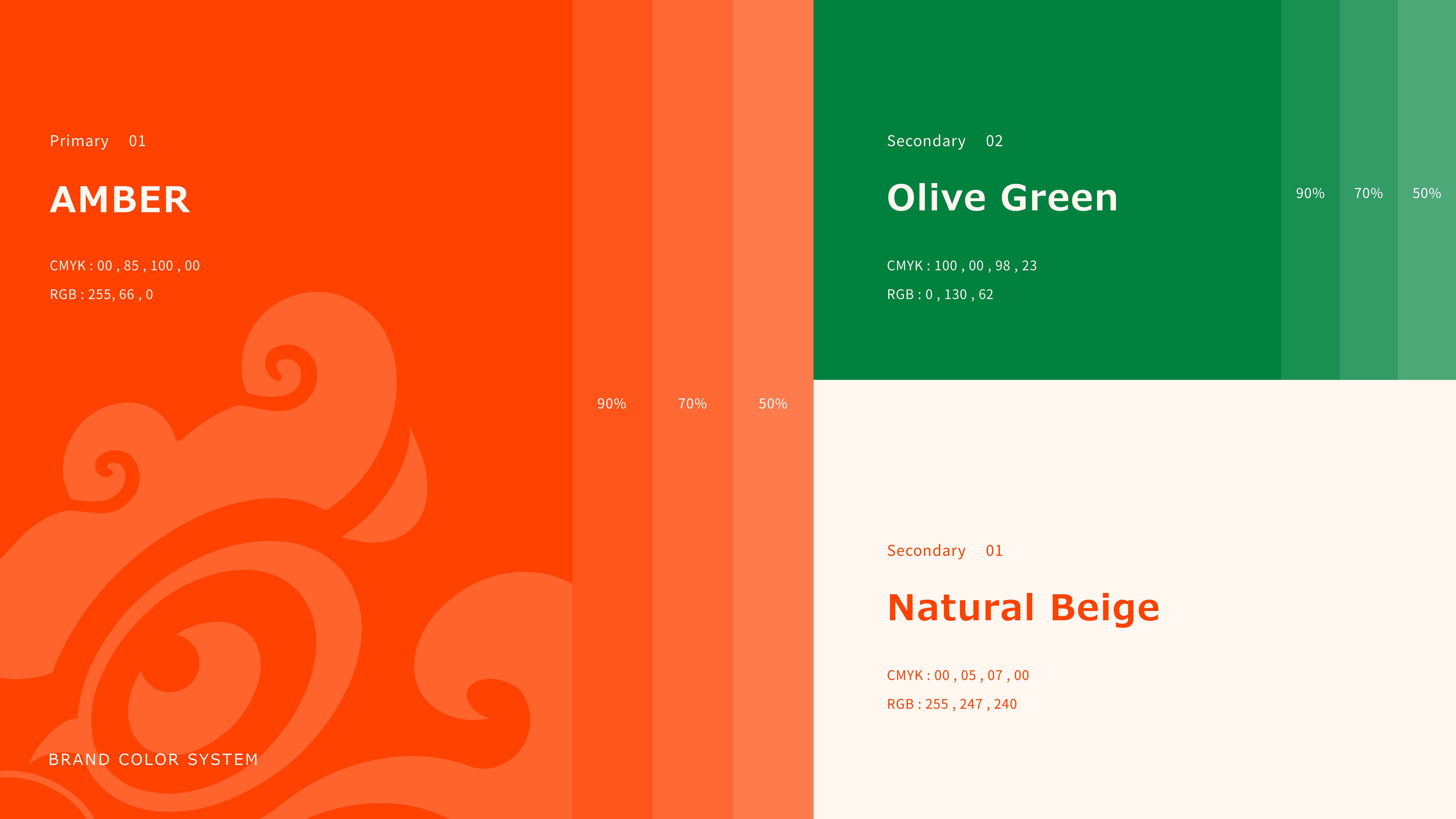
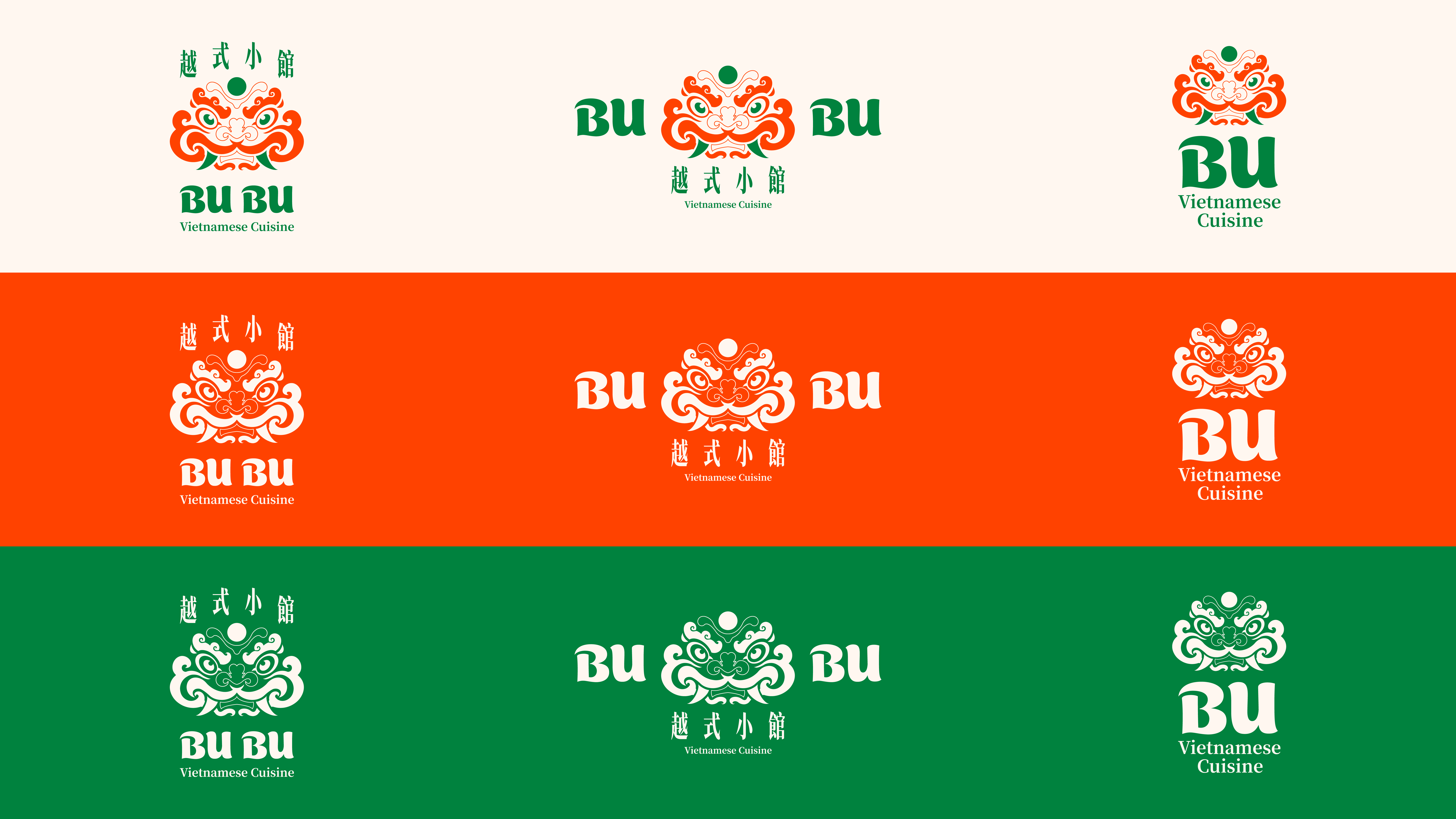
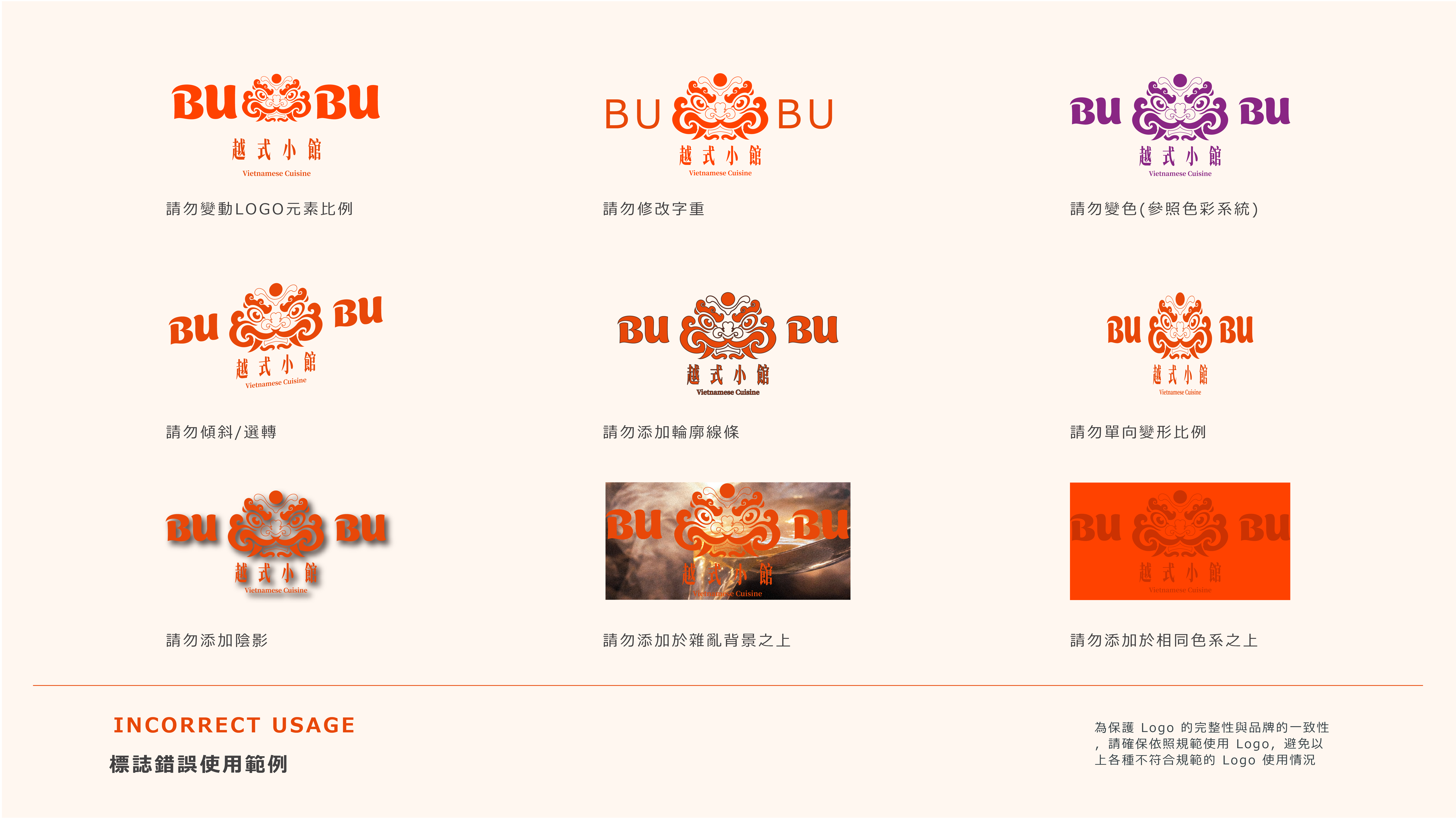
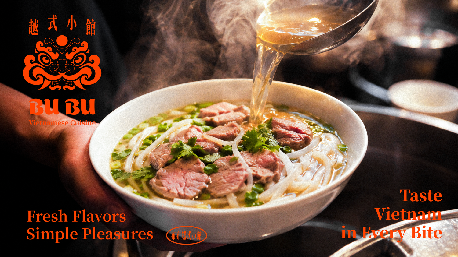
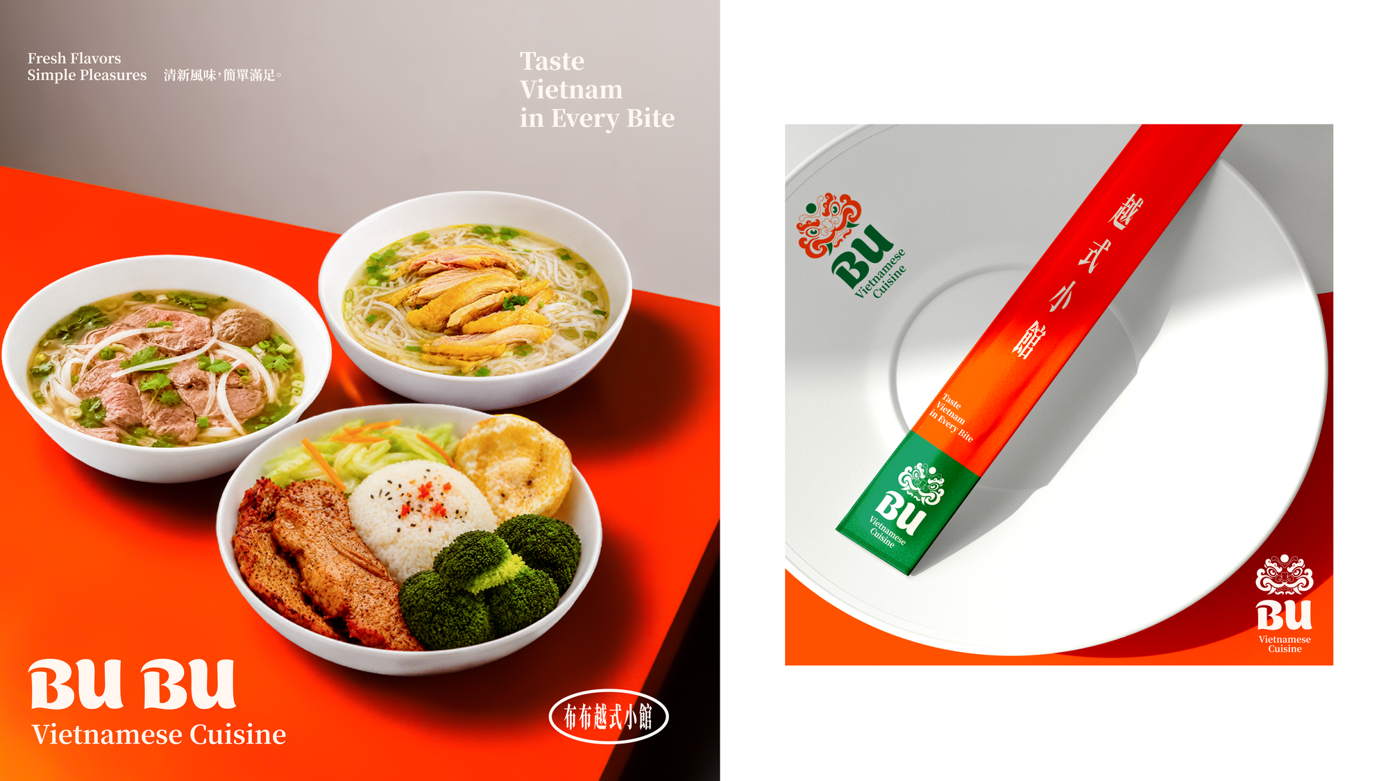
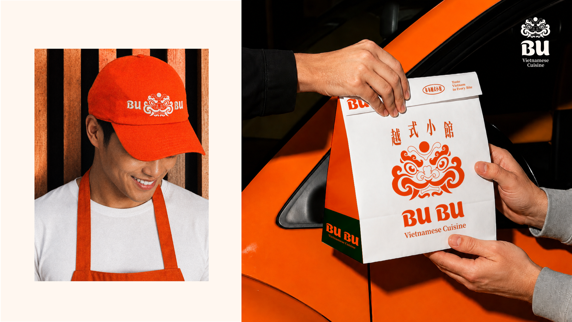
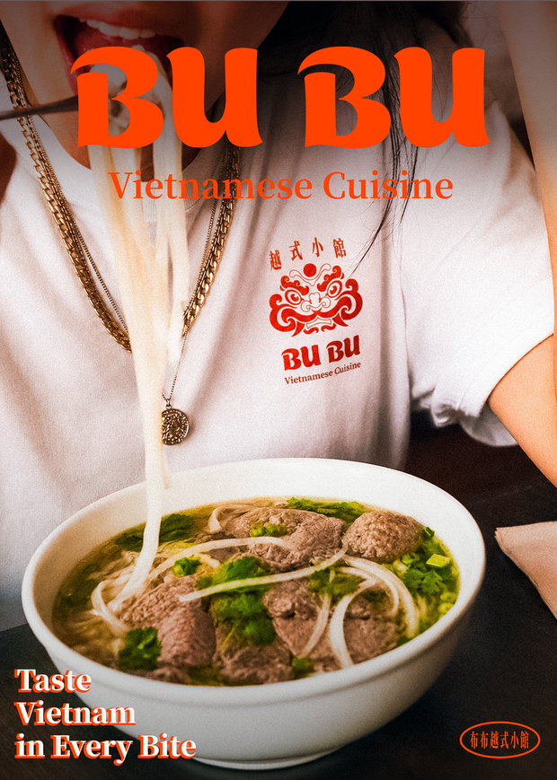
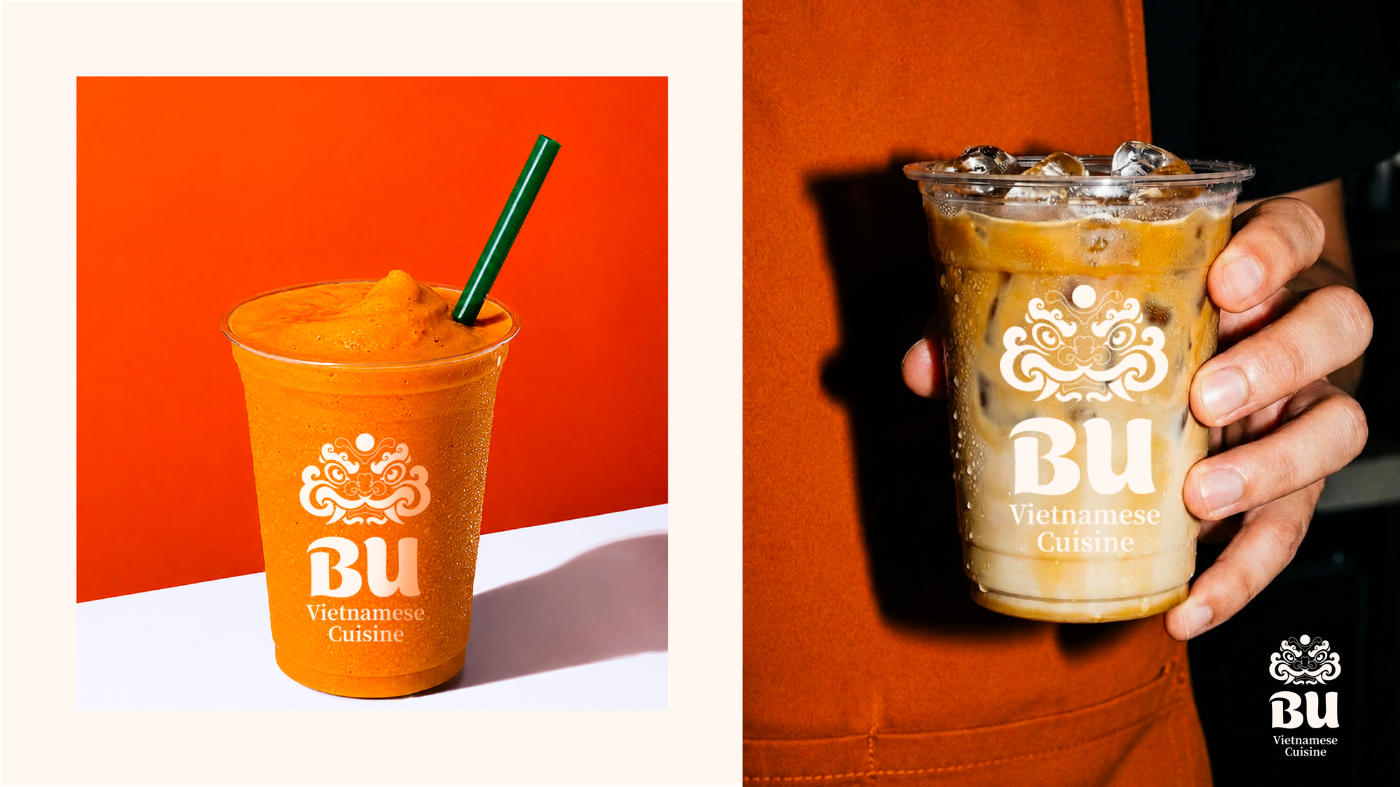
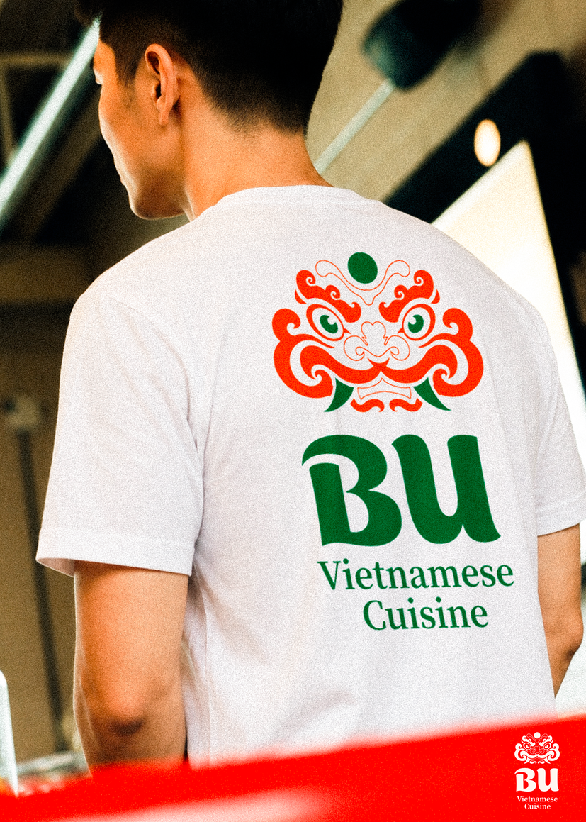
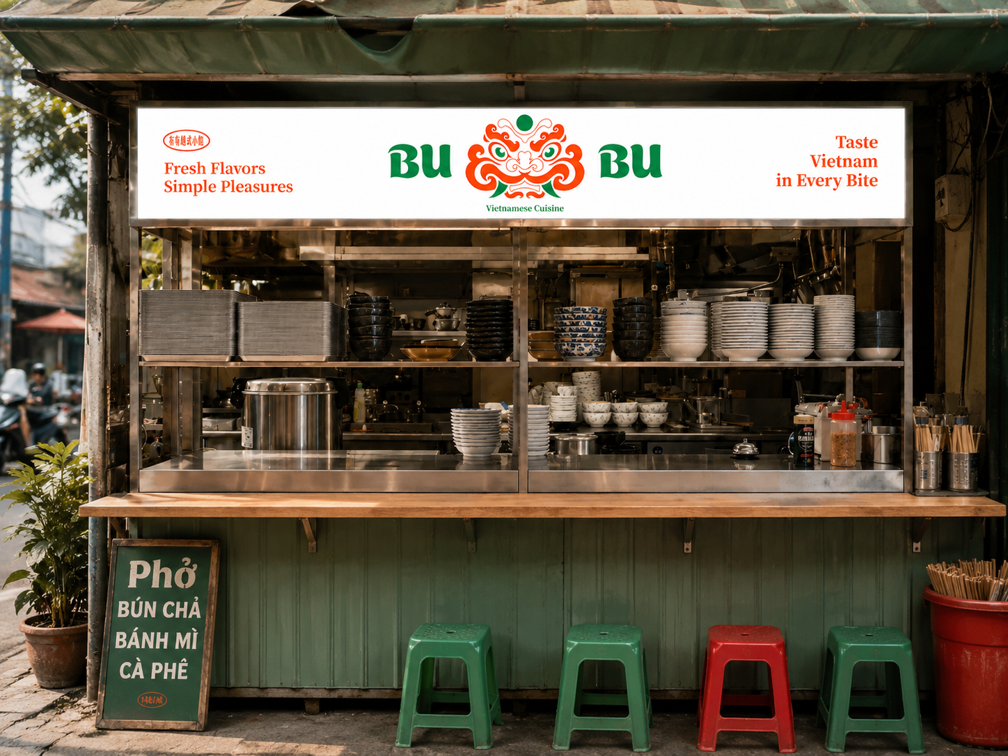
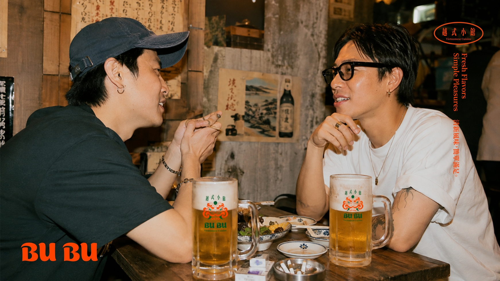
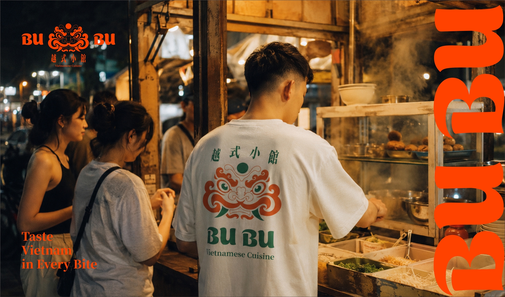
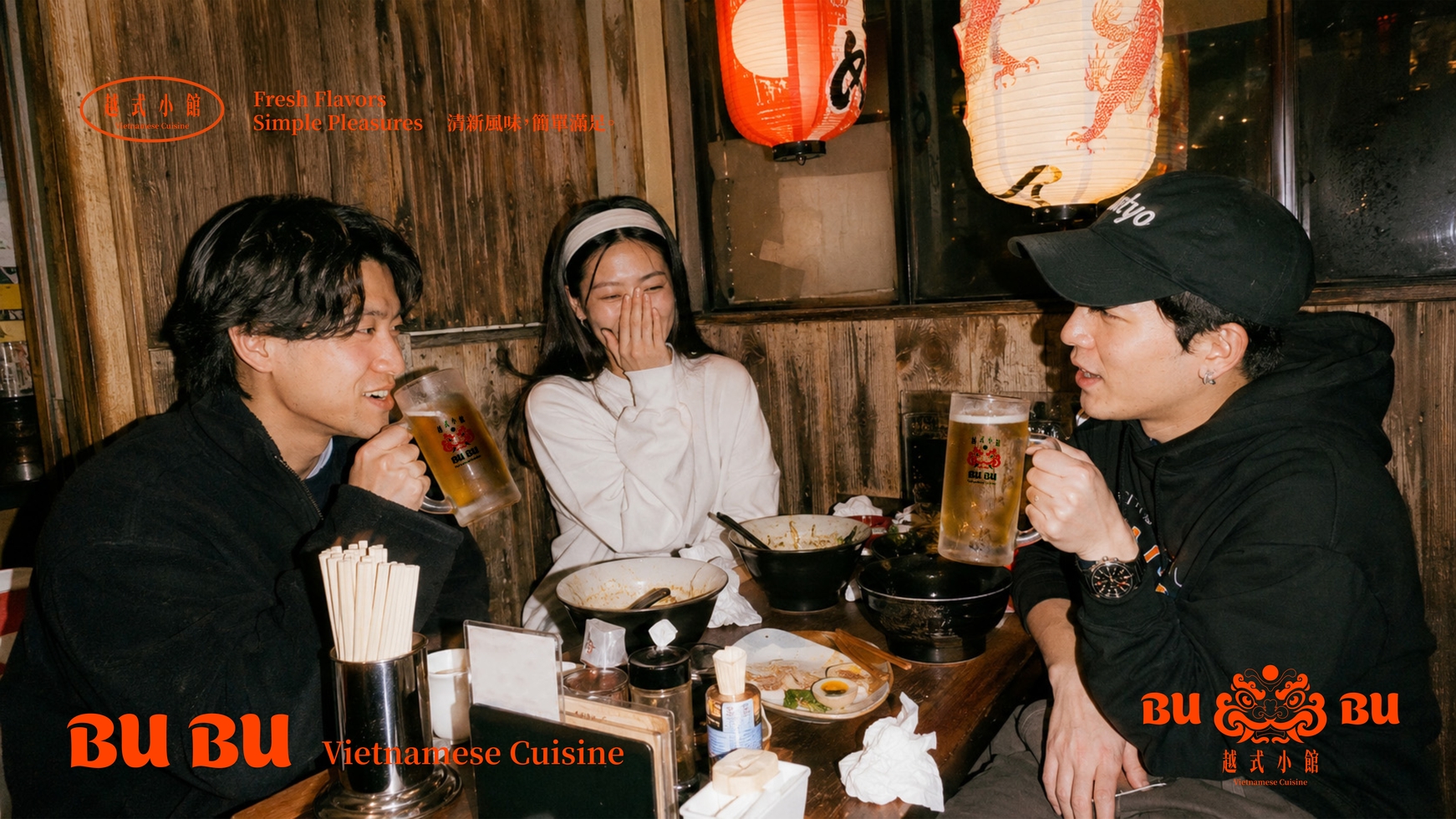
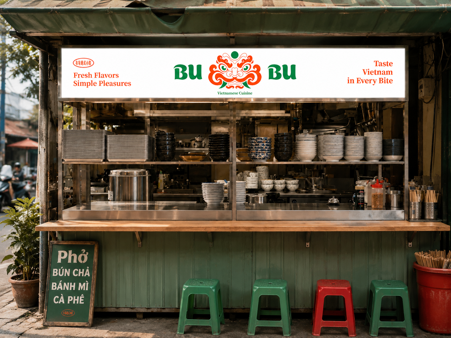
BU BU Vietnamese Cuisine Brand Identity & Visual System From guarding a place, to guarding the taste of Vietnam. 從守護一方土地,到守護一份越南的味道。 布布小館的品牌識別以越南傳統守護神獸 Nghê 為核心。 Nghê 在越南文化中象徵守護、吉祥與在地文化精神。品牌重新詮釋這項傳統符號,將「守護」從土地與建築延伸至飲食文化——守護一道料理的味道,也守護人們對家鄉與日常的記憶。 在 Logo 設計上,我們保留 Nghê 鮮明的面部特徵,重新整理繁複的傳統線條,並將鬃毛與捲曲紋樣轉化為料理熱氣般向上流動的造型。 視覺系統以高辨識度的橘色作為主要品牌色,搭配象徵新鮮香草與食材的綠色,以及具有餐桌溫度的自然米白色。鮮明但不過度現代化的色彩組合,使品牌同時保有越南街頭文化的生命力,以及新世代餐飲品牌需要的清晰辨識度。 攝影方向則刻意減少過度精緻的商業擺拍,轉而捕捉煮麵、盛湯、蒸氣、用餐、手部動作與街邊料理情境,建立更真實、更貼近越南飲食文化的品牌氛圍。 整體識別延伸至菜單、包裝、制服、飲品杯與品牌攝影,使 Nghê 不再只是一枚 Logo,而成為貫穿整個品牌體驗的視覺角色。 Fresh Flavors, Simple Pleasures. Taste Vietnam in Every Bite. BU BU Vietnamese Cuisine Brand Identity & Visual System From Guarding a Place to Guarding the Taste of Vietnam. BU BU’s brand identity is built around Nghê, a traditional Vietnamese guardian creature. In Vietnamese culture, Nghê symbolizes protection, good fortune, and local cultural spirit. For BU BU, we reinterpreted this traditional symbol and extended the meaning of “guarding” from places and architecture to food culture — protecting the flavor of each dish, while preserving memories of home and everyday life. For the logo, we retained Nghê’s distinctive facial features while simplifying its intricate traditional forms. Its flowing mane and curled motifs were reimagined as rising steam from freshly prepared food, creating a natural connection between cultural symbolism and Vietnamese cuisine. The visual system is built around a highly recognizable orange, paired with green inspired by fresh herbs and ingredients, and a warm off-white that reflects the natural simplicity of the dining table. The vibrant yet balanced palette captures the energy of Vietnamese street culture while maintaining the clarity and versatility of a contemporary food brand. The photography direction intentionally moves away from overly polished commercial styling. Instead, it captures authentic moments such as cooking noodles, serving soup, rising steam, dining, hand movements, and Vietnamese street-food scenes, creating a more genuine and culturally grounded brand atmosphere. The identity extends across menus, packaging, uniforms, beverage cups, and brand photography, allowing Nghê to become more than just a logo — it becomes a visual character that runs throughout the entire brand experience. Fresh Flavors, Simple Pleasures. Taste Vietnam in Every Bite.

依據歐盟施行的個人資料保護法,我們致力於保護您的個人資料並提供您對個人資料的掌握。
按一下「全部接受」,代表您允許我們置放 Cookie 來提升您在本網站上的使用體驗、協助我們分析網站效能和使用狀況,以及讓我們投放相關聯的行銷內容。您可以在下方管理 Cookie 設定。 按一下「同意」即代表您同意採用目前的設定,更多資訊請瀏覽 隱私權聲明。